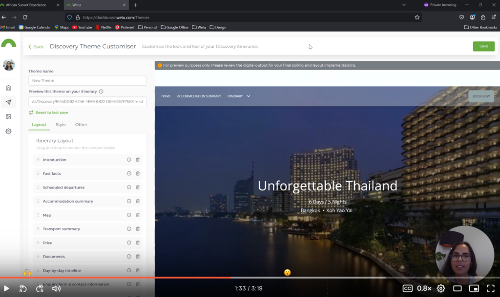
Over the last few months, we’ve been on a mission to increase the functionality for Discovery (Catch up on our last blog post here), and we’ve just released another major upgrade, Discovery itinerary now has its own Theme Customiser.
Our goal is to give you maximum control over your itineraries. Designed with drag-and-drop, our new customisation functionality gives you the power to reorder, remove, and duplicate content blocks for your Discovery itinerary, ensuring it meets your customers’ needs in the best possible way. We’ve not only given you the ability to customise the layout of the Discovery itinerary, but you can also edit the style to align it with your brand.
Peep the video tutorial below 👇

Why we think you’ll love it
- Reorder, remove and duplicate content blocks
The drag-and-drop functionality allows you to move sections, remove content, and duplicate sections, so each itinerary aligns perfectly with your vision. This intuitive approach allows for a streamlined, engaging client experience that makes each journey feel bespoke.
- Apply your own colour palette
Brand identity is key, and now you can bring it into your itineraries with custom colour options. Whether you’re creating a serene, beach-inspired palette or vibrant shades for an adventurous excursion, the Discovery Theme Customiser makes it easy to seamlessly reflect your brand’s identity.
- Preview in real time
Watch your edits unfold with a live preview feature on the Discovery Theme Customiser. This transparent approach means no more toggling between screens – you can see exactly how your changes look as you build your themes.
- Sell the travel dream
Adjust and fine-tune the layout and style to focus on what matters most for each traveller, specific to where they are in their buying journey. Imagine a client planning a journey to Thailand, with Discovery Theme Customiser, you can craft an itinerary that doesn’t just reflect the destination but also aligns with your brand’s style. From colour choices to content block arrangement, you’re in control, building an experience that makes a lasting impression.
We have big plans for our itineraries and are just getting started. Look out for more exciting updates that show our commitment to making Wetu work for you and your business.
If you’re currently on a Lite package but want to be in the driver’s seat when it comes to itinerary customisation, have a look at our Premium and Enterprise pricing options
PS – Don’t forget to sign up to our Opt-in list to receive our latest product release announcements.